WARNING: This article contains traces of Amazium!
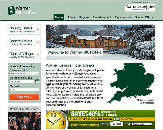
Responsive design is a relatively new concept in website creation and it was an approach I thought would be perfect for our new microsite for Warner Leisure Hotels (www.warnerukhotels.co.uk). Rather than create multiple sites for multiple devices, I wanted to build a site that could easily adapt to the devices upon which it was being viewed. Responsive Design was the perfect solution.
So where to Start?
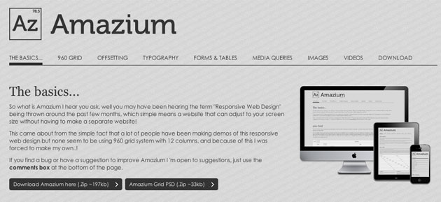
Researching the best ways to make a Responsive website was the first place I started. There were 2 options: either create your own media queries from scratch or use a framework. When looking into Responsive frameworks it became apparent that this was the easiest and quickest way to do this. I came across quite a few good frameworks such as; Less Framework, 320 and up, Mobile Boilerplate, Frameless Grid and Amazium. I decided that the best Framework for me to use was the Amazium framework, as it used the 960 grid system which I had designed the site in and it looked the easiest to integrate into a ModX website, and amazing it was!
Many say that websites should be designed with Mobile in mind (some say ‘Mobile First’) so it was important that I had already designed the site for both mobiles and tablets, so I knew what the site would look like on these screen sizes.
Amazium Framework
The Amazium framework is based on the 960grid system with 12 columns. Each column has a unique class to give sections of a site the right width, depending on which device you are looking at it on. It’s so easy to use – so, say you wanted your site to have a left nav of 3 columns and the content area of 9 columns, the class for these would be: ‘grid_3’ & ‘grid_9’ and Amazium does the rest for you, as the media queries are already set up.

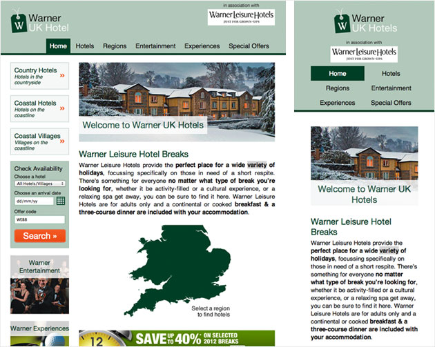
You can change styles in the Amazium framework so it looks exactly how you want it to, but it is as easy as that! Every element in this framework is adjustable from divs to forms to videos & images. The media queries included are set up for; all browsers (over 960px), tabletportrait (728px), mobile landscape (420px) & mobile portrait (300px). This is an amazing framework and I will be using this on every project going forward – what a great new addition to any web designer’s toolbox!
The Results
‘The new Warner Leisure Hotels microsite works perfectly on all devices. There were a few little issues along the way such as images being quite large in size (so they could be scaled nicely, especially for mobile) so they had to be compressed as much as possible, without looking pixelated. The Amazium styles weren’t exactly as needed but a bit of tweaking got the site to look exactly as it should. All in all, Amazium didn’t take too long to implement, was relatively easy to use and we now have a completely mobile friendly website.


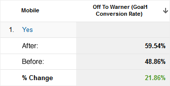
Since the launch of the new site with the Responsive layout we have seen a 21.86% uplift in CTR, which is a great so we can show potential clients that making a site Responsive really is worth it!


