
One thing I always loved about Star Trek was the maps of the galaxy they had on the bridge of the Starship Enterprise, showing and labeling the stars and planets of different alien civilizations. I loved the rich backdrop these maps put behind the show, making its futuristic premise of an explored galaxy of technologically advanced civilizations seem real.

My current vocation of SEO hasn’t yet taken me to navigating the galaxy on a starship, but it has taken me deep into keyword market analysis – and that’s something that can be made to (sort of) look like it’s from Mr Data’s computer terminal on the Enterprise bridge.
In SEO, keyword market analysis answers this question:
What are people searching for online in relation to what you sell, and how often are they searching for those things?
If you are running a website without this knowledge, it will be difficult to know which new pages to make or which existing ones to improve to achieve your growth goals in organic search.
In this post, it is assumed you have already done this analysis in a spreadsheet, and having put your keywords into groups are now looking to present the findings about what the market looks like to your client visually. This post is about the market visualisation I like to use and how it’s made.
If you haven’t got your keywords grouped yet, I recommend taking a look at the predecessor post to this one, how to easily group all your keywords.
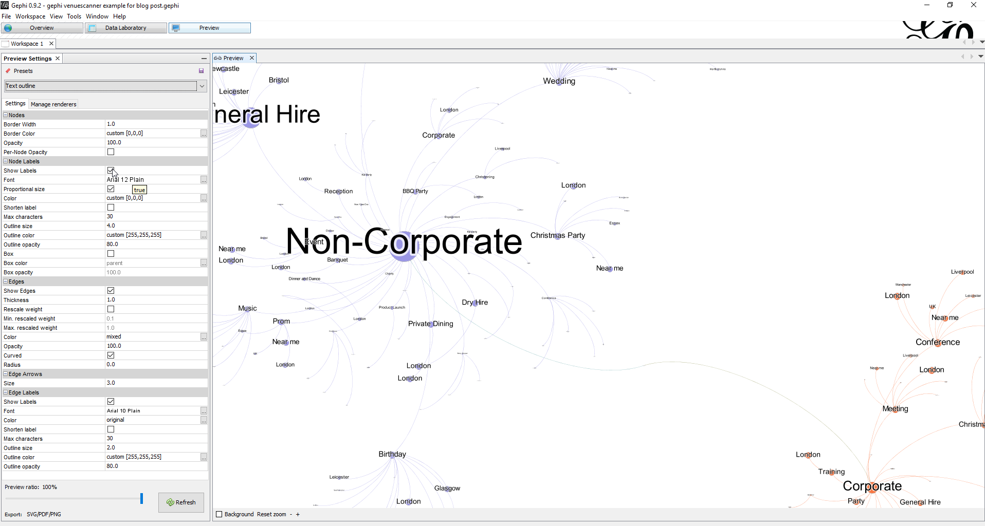
Market Map
A Market Map is an image of a market. It’s like taking a shareable photo of what the market really looks like, as revealed by the keyword analysis you have done.
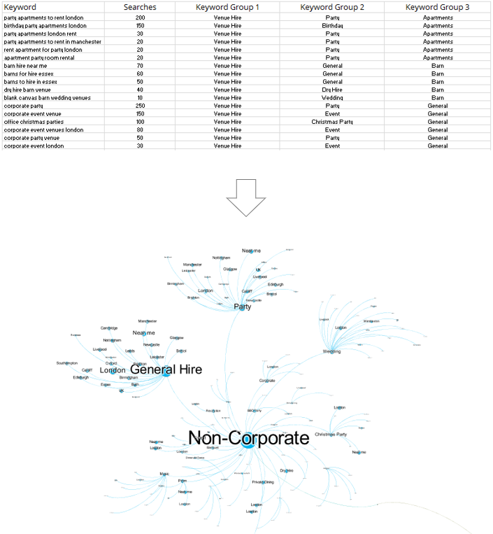
A market map turns a spreadsheet into a galaxy. In the image below:
- The lines show how the keyword groups are structured.
- The circles shows how popular these keyword groups are relative to each other by their size (also shown by label size)
- The colours represent the taxonomies and are customisable.
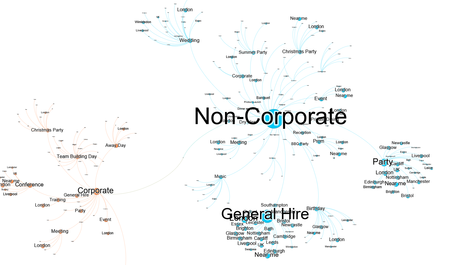
The colours show the 2 main galactic empires in the venue space – ‘corporate’ & ‘non-corporate’. The circles show the relative search volume for corporate keywords e.g. ‘team building venue’ and non-corporate keywords e.g. ‘party venues bristol’, split into sub-groups that show market structure.
Here’s a full size version that’s big enough to navigate like a galaxy (you may need to scroll around).
Why use a Market Map?
Keyword market analysis is how you know where to aim your search strategy. The Market Map communicates how you know this to anyone who would like to understand without asking the viewer to think about numbers, or requiring them to interact with a spreadsheet. As a single image, it can be physically pointed at, printed out and stuck on the fridge.
A short verbal explainer of what the coloured structures mean is recommended beforehand. Once your audience is on board, you can sit down in the war room and strategise together for galactic domination.

No Excel or programming expertise is needed to make a market map.
It takes 45 minutes to get familiar with a free graph making program called Gephi using the instructions in this post. Once you’ve learned it, you can churn these out in 20 minutes, depending on how much of a perfectionist you are.
Delight your audience
Keyword analysis spreadsheets are boring. Useful, sure. Profitable, definitely. You really should pay attention. Throw in some Excel charts and they’ve graduated from boring to a bit less boring. But still boring. The left brain is engaged and dutiful, but tired. The right brain wants to go play outside.
Edu-tain your audience and they’ll be grateful that you made their working day a bit more fun. They’ll have both brain hemispheres focused on your presentation and won’t have a memory of suffering associated with it.
Give confidence without complication
Once they’ve done their analysis, the analysts at a digital agency can communicate what they’ve found in a short email or phone call. It might be something as simple as ‘Focus on groups X, Y and Z in this order and follow our recommendations for implementation on this month-by-month’.
But if I was paying for keyword analysis in my market, I’d want a little something more when it comes to the analysis part, because I’m not just paying for the answer – I’m paying for confidence and peace of mind. I need some understanding of why that answer is the answer, even if I’m a complete beginner in digital marketing. I want to rest easy with my own judgment satisfied, as well as putting my trust in the agency.
At the same time, I’d prefer to avoid getting too deep into the numbers, and I can’t really spare the time to learn SEO myself. I don’t need all the details, just a good picture.
Here’s how to make one.
How to Make a Market Map for Your Client
This 4 step process will require about 45 minutes of your time to learn. It is fiddly (Gephi is not very user friendly), but crucially, it does not require expertise in Excel or any coding knowledge.
Here are the steps:
- Format your keyword market analysis data.
- Process this data using the Gephi data transformer Google sheet.
- Install Gephi and upload your newly processed data.
- Make your Market Map visualisation in Gephi.
1. Format your keyword market analysis data
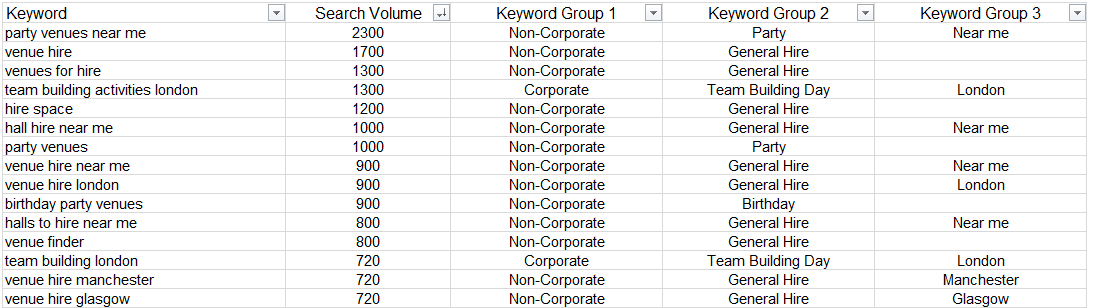
Most of the time, my keyword research has these columns in it from left to right: keyword, search volume, keyword group level 1 (e.g. item: theatre tickets), keyword group level 2 (e.g. show: matilda), keyword group level 3 (e.g. location: london)
A Quick Recap on Keyword Grouping
If you haven’t got your keywords grouped yet, I recommend reading this post about how to easily group all your keywords before proceeding.
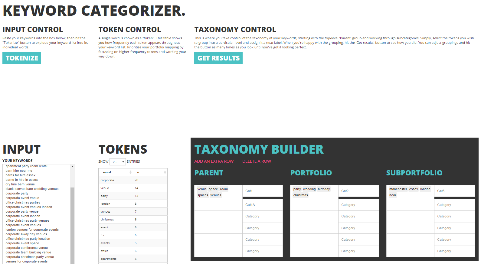
At Found we’ve moved our processes on a little since February when that post was written, with the arrival of the Keyword Categorizer. This tool in development is a custom-built solution to the problem of keyword categorization, which will soon provide the opportunity to perform the work for those who would prefer to operate outside of Excel. This is currently internal only, but here’s a sneak preview of this classy tool:
So if you’ve got your keywords grouped, let’s continue.
The Market Map visualisation deals in keyword groups, not keywords. So you don’t actually need your keyword column – just the search volume for each keyword, and the groups.
Sound too easy? Yeah, it was. The groups need to also meet these criteria:
- The groups need to flow hierarchically from left to right, like the growing branches of a tree, without any blanks in the middle.
- Groups 1 and 2 shouldn’t have any blanks. If you have some rows containing blanks for these columns, replace them with ‘general’ or whatever works best.
- Group 3 can have blanks because it’s the end of the hierarchical line.
Think of it like a tree – you can’t have leaves without the middle of the branch that supports them. But you can have branches without any leaves.
2. Process this data using the Gephi converter Google sheet.
Gephi eats a special diet made up of 2 special csv files called Nodes.csv and Edges.csv. Nodes are the keyword groups themselves and their size, and edges are the map part – which nodes are connected to the other nodes based on the way the keyword groups have been hierarchically arranged in your spreadsheet.
Turning keyword analysis spreadsheets into these 2 files is the biggest barrier to creating the Market Map. Here’s a converter that does this for you. It’s made in Google sheets to leverage the powerful Query functions that can automatically transform your keyword analysis data into the very specific format it needs to be in for Gephi to read it and make the Market Map.
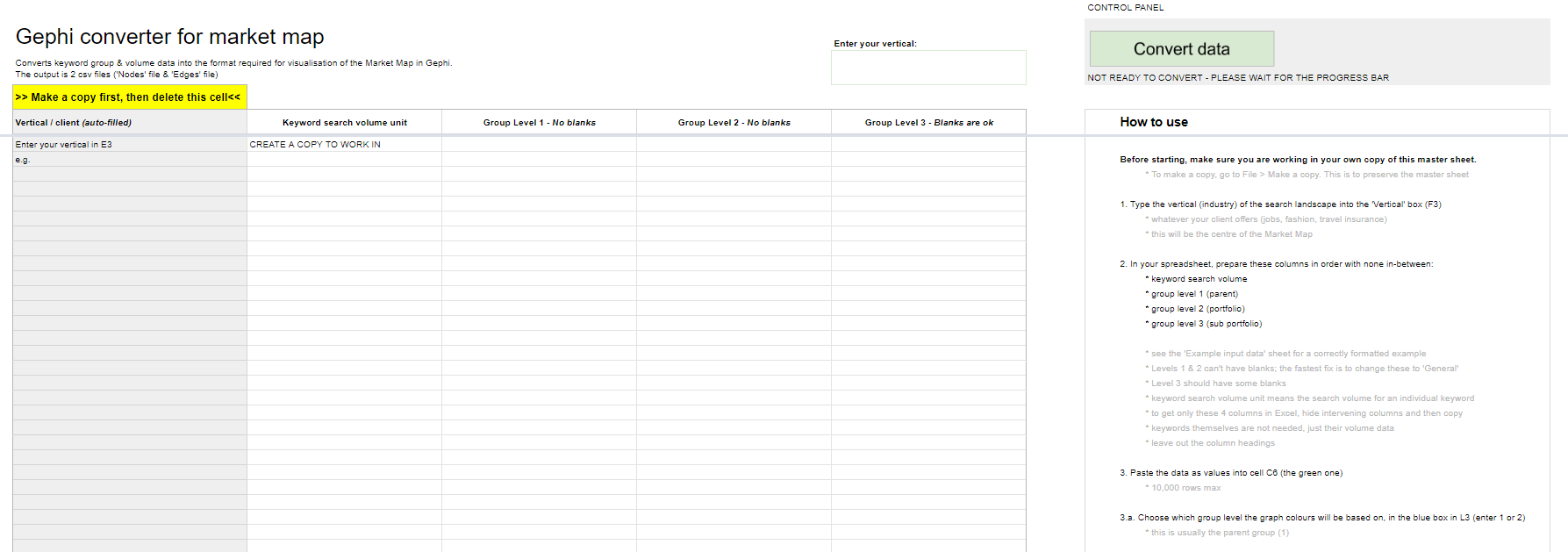
Visit the Gephi converter here and follow the instructions. It will ask you to:
- Make your own copy of the Sheet first
- Follow the instructions
- Wait 5 minutes
- Download the 2 .csv output files
Remember to make a copy first and work in the copy so the master isn’t overwritten!
3. Install Gephi
So first you install the program, it’s free: https://gephi.org/users/install/
Gephi works with Java so you will need the most up to date version of Java installed and running on your system: https://www.java.com/en/download/
When I installed it and tried to open it, I got an error message and had to find, open up and edit a text file called gephi.conf in the Gephi folder: C:Program FilesGephi-0.9.2etc
I needed to add the path to my java installation, which is in the double quotes on the first line below, and then save:
jdkhome="C:Program Files (x86)Javajre1.8.0_191"

# ${HOME} will be replaced by user home directory according to platform
default_userdir="${HOME}/.${APPNAME}/0.9.2/dev"
Hopefully you won’t get the error and can skip this.
Be forewarned – Gephi is buggy so there’s a chance it might just not like your computer, but there are forum threads out there for most of these issues. So there might be a bit of Google searching and troubleshooting that you need to do before it works.
Uploading your processed data to Gephi:
- Start Gephi
- Click new project
- Click data laboratory at the top
- Click Nodes on the left
- Click Import Spreadsheet and select your nodes.csv file that you created in the data converter.
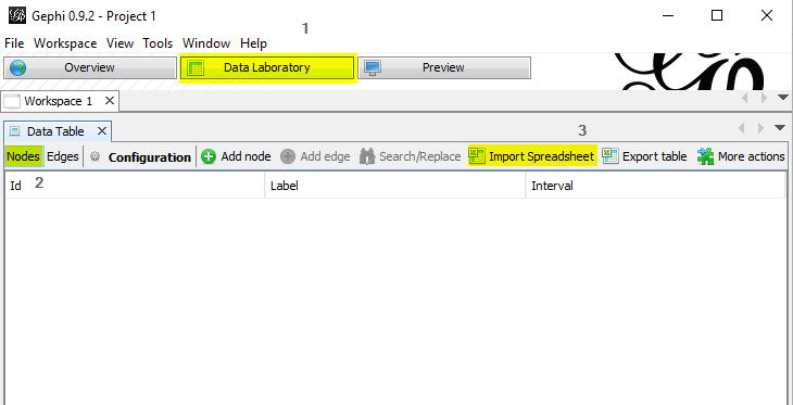
- Click Next, Finish.
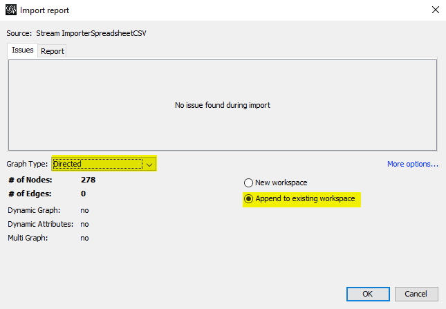
- You should see the below. Set Graph type to ‘Directed’ and select ‘append to existing workspace’, then click ok and you’ll see the finished Node table.
- Now, do the same for the edges.csv where the option exists, remembering to select ‘append to existing workspace’ in the same way.
4. Make your Market Map visualisation in Gephi
Click overview, next to data laboratory.
This is what you should see:
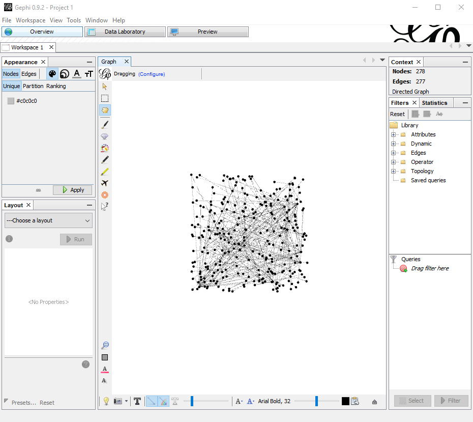
Each dot is a keyword group, linked to its parent and child groups by the lines.
Showing search demand
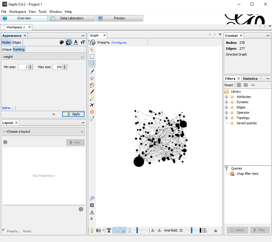
Next, let’s tell Gephi to size the dots based on search demand.
In Appearance in the top left:
- Select ‘Nodes’
- Click the circles button
- Click Ranking just below
- Select ‘weight’ from the menu.
Set max size to 100, then click Apply below.
You should now be seeing something like this:
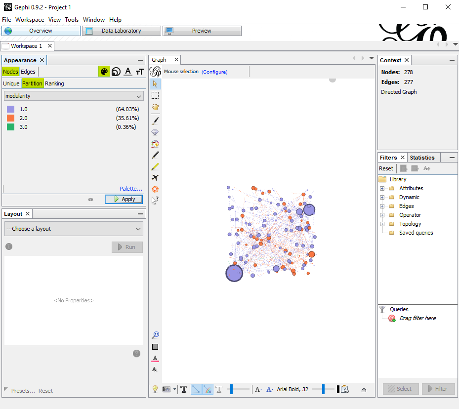
Colour coding the keyword groups
It’s all a bit black and white. Add a splash of colour by following these steps:
In Appearance in the top left:
- Select ‘Nodes’
- Click the paint palette button
- Click Partition just below
- Select ‘modularity’ from the menu.
Then click ‘Apply’ below. Now there are colours that represent your keyword groups. Usually this is for the parent groups because having a special colour for each sub group starts to get silly. You can change them manually too if you want.
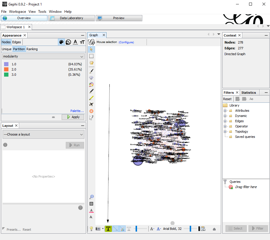
Labeling the keyword groups
At the moment you don’t know which group is which, although you can probably guess that the ridiculously huge one has the name ‘general’.
This one’s simple, just a button click.
Layout – Bringing it to life
It’s all in a square right now – you can’t see anything really. So let’s play with the layout tab.
Here is the recipe I use to create the Search Universe layout.
- Select Label Adjust from the Layout dropdown menu on the bottom left.
- Click ‘Run’. You’ll see the labels all spacing out nicely.
- Select ‘Yifan Hu Proportional’ at the bottom of the dropdown list and Run it as many times as it takes for it to start to look good.
- If it’s still looking bunched together, run Expansion or Label Adjust from the manu again a few times.
When all is said and done, you should have something like this:
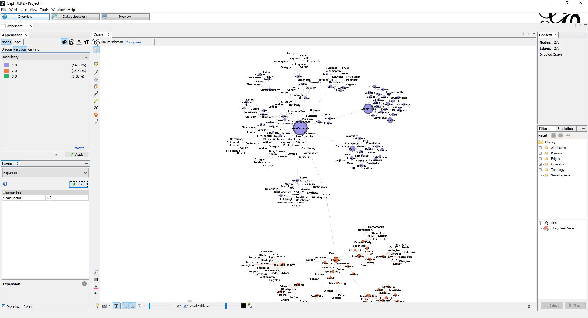
The galaxy is taking shape. Bit it’s looking a bit rough around the edges.
Now, up next to data laboratory, click on preview. Here, there are some options to help us to give the visualisation a professional finish.
Finishing touches
In the Preview area, there are some options to help us to give the visualisation a professional finish:
- Click Preview, next to data laboratory
- Click ‘Refresh’ at the bottom. The visualisation will appear, with some cool curved lines which create the galaxy effect.
- Tick ‘show labels’ on the left
- From the Presets dropdown menu at the top, click ‘Text outline’
- Click ‘Refresh’ again.
Export
Your client probably doesn’t have Gephi installed, so you’re going to need to export what you have just masterfully created.
To export, go to File at top left and choose the format you want.
- SVG – Huge, best quality but cumbersome, use for presenting. They do look good on the big screen, and you can make it look like you’re flying through the keyword groups.
- PNG – Small, a bit blurry, good for previews and not much else.
- PDF – Smaller but pretty nice quality, I like this one.
And that’s how you make a Market Map.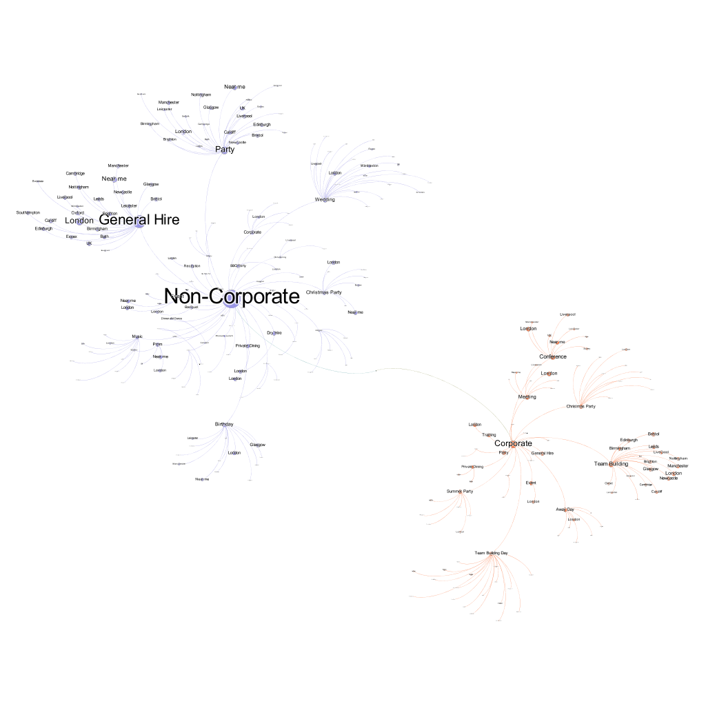
Found is the Everysearch™ agency, a master of search performance across all PPC, SEO, paid social, and creative content.

